In this live stream we took a first look at Mobile Menu CK and it was pretty rough, lol. It took a while to figure out some things because I had some different ideas about how things worked. I only mention that because I don't think you should judge the extension by this video.
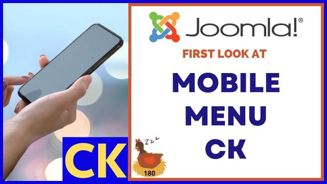
- Video is about Mobile Menu CK for Joomla 4.
- Presented by Tim Davis on YouTube.
- Sponsored by MySite.guru for Joomla site audits.
- Tim mentions being sick but is feeling better.
- Tim shows Joomla 4 default installation.
- Tim downloads Mobile Menu CK and Extension Manager CK.
- Tim explores Mobile Menu CK features.
- Tim installs and configures Mobile Menu CK.
- Tim discusses changing menu items for mobile.
- Tim troubleshoots an issue with menu changes.
- Tim attempts to validate the cache.
- The video continues with more troubleshooting.
SUBSCRIBE TODAY! ► https://goo.gl/N6y5bH
Watch Me Work live streams ► • Find and Replace ...
Here are some of the links mentioned in this Live Stream - and some others:
Contact Tim Davis ►
Joomla Training Cohort ► https://cybersalt.com/jtc
mySites.guru ► https://mysites.guru
MigrateMe 4 ► https://www.php-web-design.
Stageit for Joomla ► • First Look at Sta...
Backing Up Your Joomla Site with Akeeba ► • How to Backup a J...
Better Frontend Link ► https://regularlabs.com/
FOLLOW US ON X (Twitter)! ► @basicjoomla
Like Us On FaceBook! ► https://www.facebook.com/

Add comment